Website Re-platforming Project
Comany name
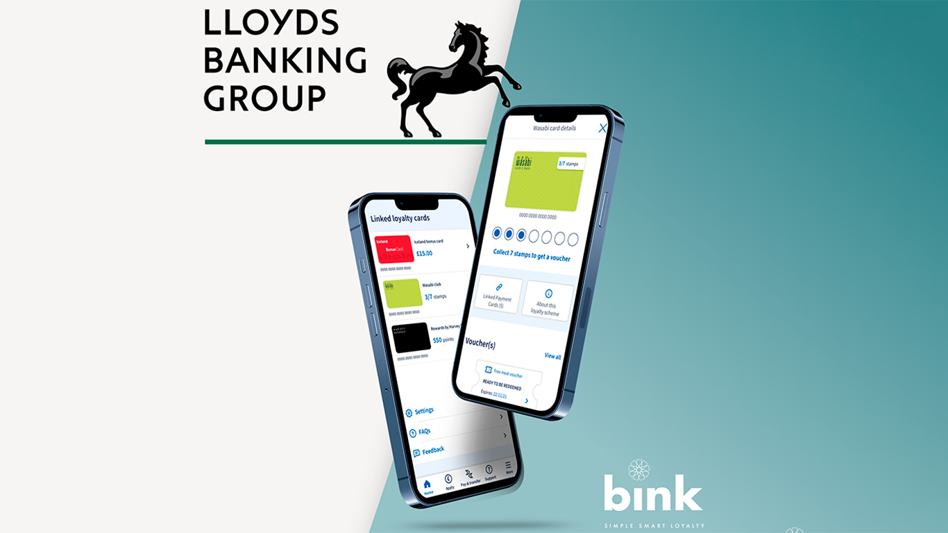
Lloyds Banking Group
Industry
Banking / FInancial Services
Company size
10k + employees
Timeline
Jul 21 - Jun 22
Lloyds Banking Group
Banking / FInancial Services
10k + employees
Jul 21 - Jun 22
Countrywide owned dozens of regional estate agency brands—each needing a strong online presence, but with shared functionality behind the scenes.
I helped design a scalable, component-driven CMS template that now powers over 60 brand websites, allowing each one to feel local and distinct while running on a centralised system that’s easy to maintain.


The existing extras page made it difficult for users to understand what they were adding—or if they’d added anything at all. This led to low engagement with optional products, frustrated customers, and missed revenue opportunities.
At the same time, the design team was juggling inconsistent components in Sketch, making it hard to test improvements or maintain design quality across flows.
We took a stripped-back approach to the extras journey—focusing on clarity, selection feedback, and minimal friction.
Alongside that, I supported the team in shifting to Figma, helping convert core components, refine structure, and lay the foundations for a more reliable and scalable design system. This work ensured future updates would be easier to build, test, and ship.

The redesigned extras page made it easier for users to understand and manage add-ons with confidence—leading to a smoother booking experience and better engagement. Behind the scenes, the move to Figma and the design system improvements gave the team a more consistent, scalable, and collaborative way of working. It wasn’t just a UI upgrade—it was a step toward design maturity.
