Grant Finder Redesign
Comany name
E.ON Next
Industry
Energy / Utilities
Company size
1K-5K employees
Timeline
Feb 25 - Jun 25
# Summary
Redesigning E.ON Next’s grant eligibility journey.
This engagement focused on the ongoing maintenance, governance, and evolution of a live design system used across multiple product teams, ensuring consistency, scalability, and safe contribution as the system matured.
Services
- UX design
- UI design
- End-to-end user flows
- Design system integration
- Accessibility and inclusive design
- Prototyping
- Developer handover
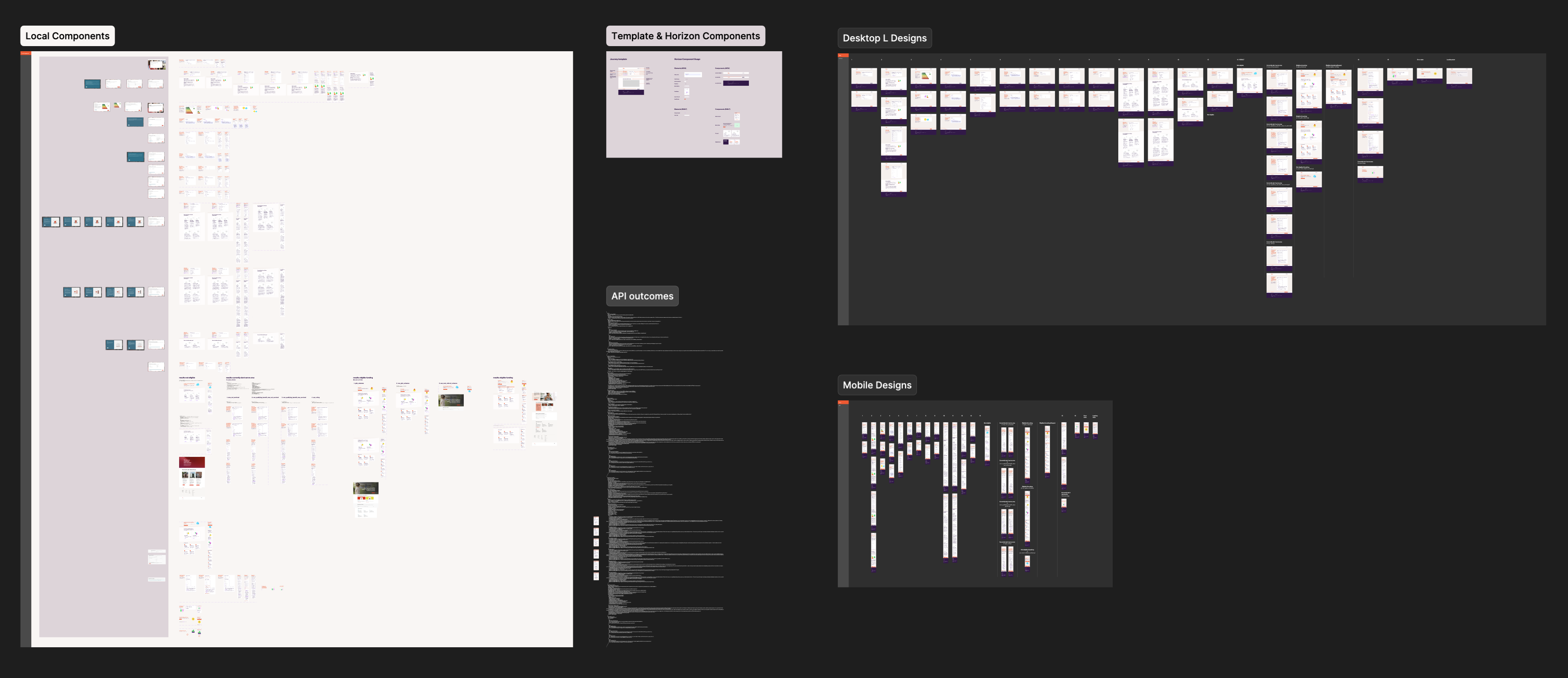
Deliverables
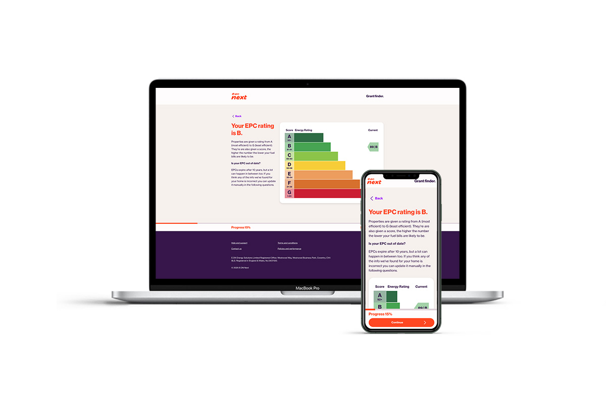
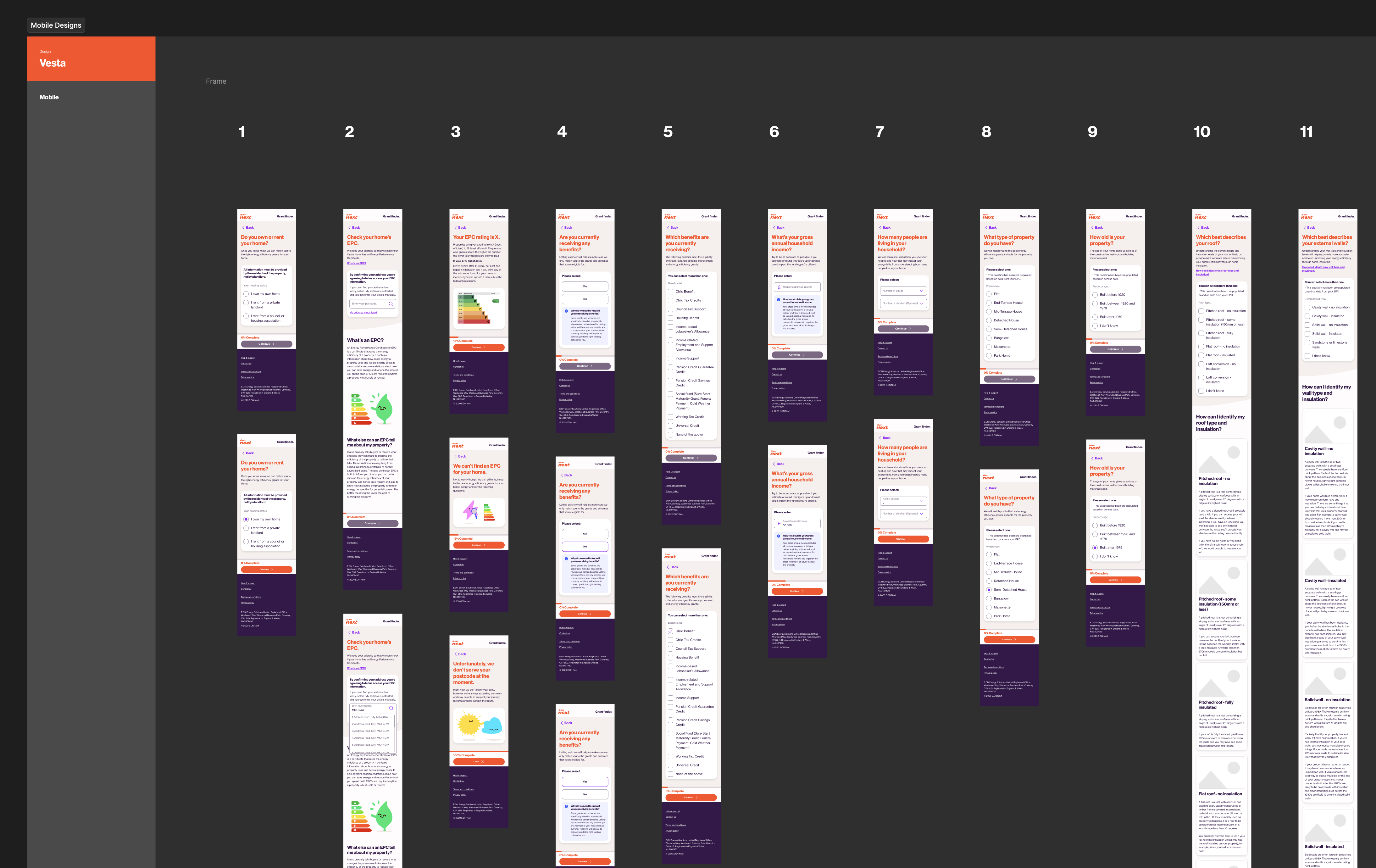
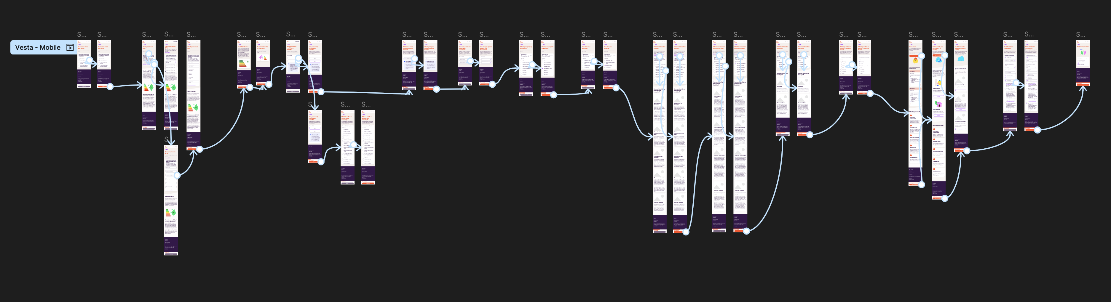
- Full desktop & mobile UX flows
- Scalable journey template
- 50+ UI screens
- Component and layout specs
- Developer-ready Figma file
- Interactive prototype
Outcomes
The redesigned journey improved clarity and made the complex eligibility process far easier for customers to navigate, especially on mobile. The new reusable journey template now supports multiple teams across E.ON Next, speeding up future delivery and reducing engineering effort.
The final product launched with a high level of design fidelity, closely matching the Figma templates and delivering a clean, consistent, on-brand experience.
# Understanding the problem
Unpicking legacy journeys to uncover what wasn’t working
Identifying the friction points
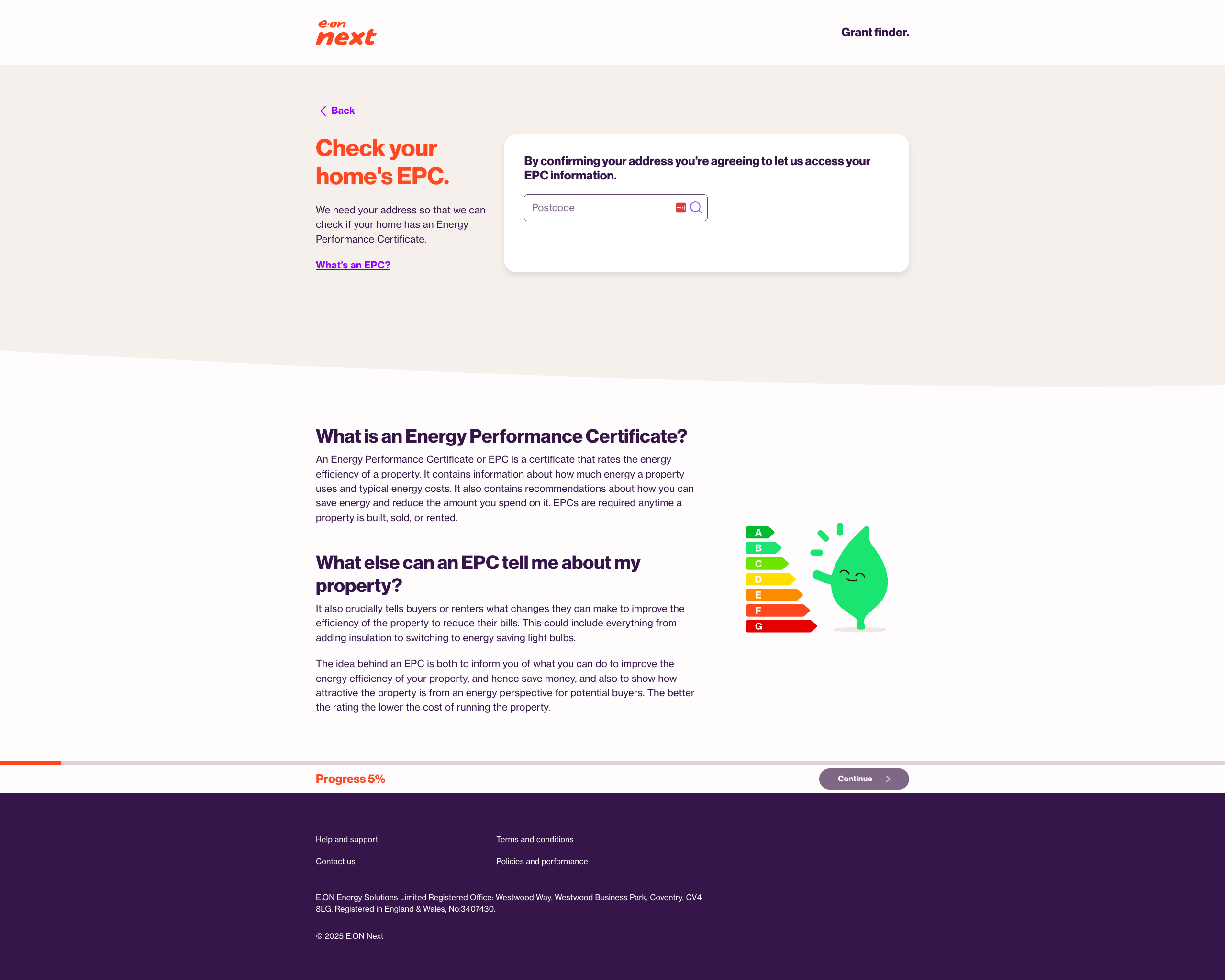
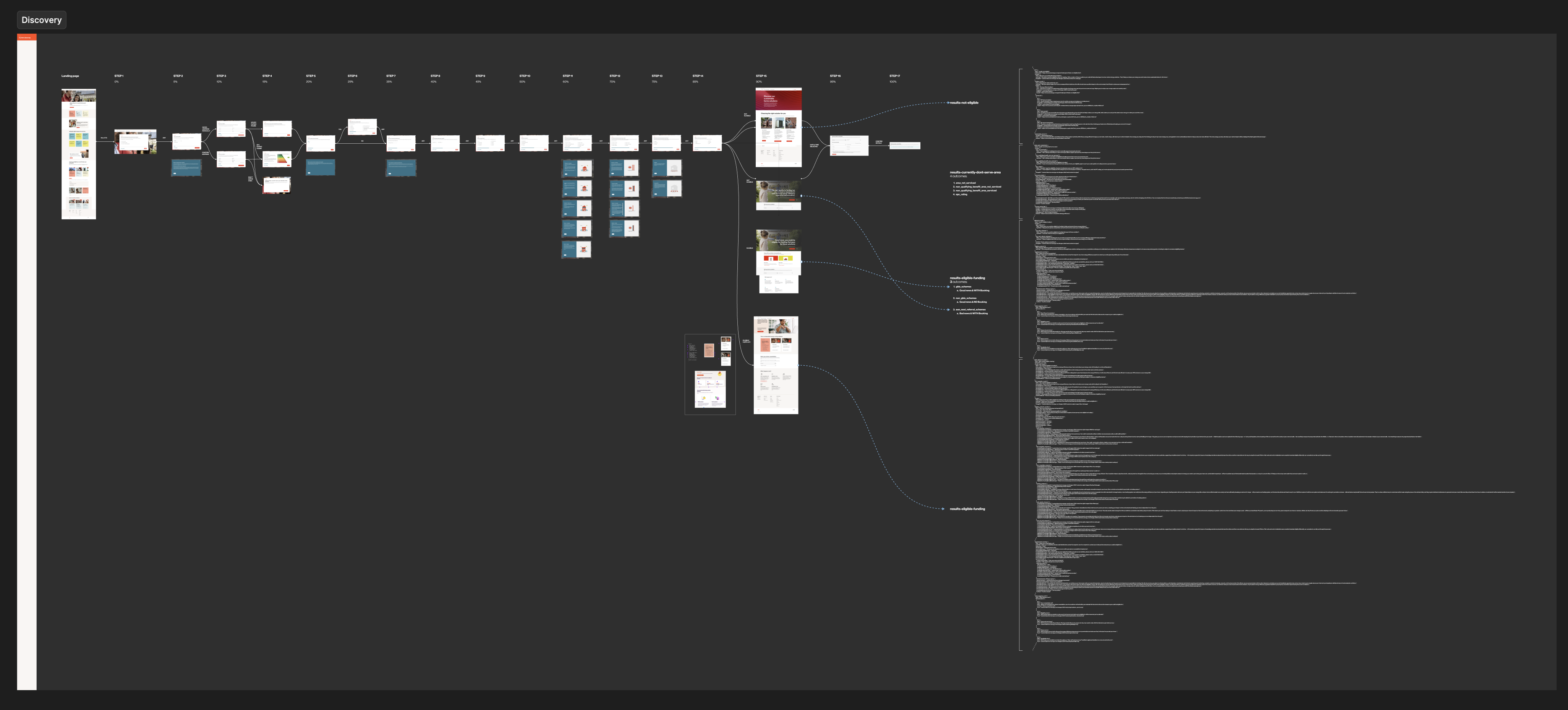
The existing grant eligibility journey had evolved over several years without a unified design approach. Pages varied in structure and styling, mixing legacy E.ON, E.ON Next and outdated templates. The lack of hierarchy and predictable flow made the experience difficult to follow, particularly on mobile where most users accessed the tool.
Complex branching logic—such as EPC checks, benefits eligibility and property criteria—was not explained clearly to users, leading to friction and unnecessary drop-off. The business also lacked a scalable pattern for future eligibility journeys, causing repeated design and engineering work.

# The solution
A structured, mobile-first framework for every user path
Built on Horizon DS
I redesigned the entire journey as a modern, mobile-first flow built on Horizon Design System foundations. A new reusable journey template provided structure and consistency across every question and step, making the experience clearer for users and easier to maintain for teams.
All screens were rebuilt using Horizon DS components and tokens, ensuring a clean, accessible interface that aligned fully with the refreshed E.ON Next brand. The final design system file included auto-layout components, states and a working prototype to support engineers throughout delivery.
Key moves
- Introduced a scalable journey template for all question types
- Rebuilt every step using Horizon DS components and tokens
- Simplified screens to reduce cognitive load and improve mobile flow
- Mapped all eligibility paths, outcomes and variations
- Delivered a fully componentised Figma file with prototype and specs
- Refined copy with content designers for clearer, shorter questions
# Outcomes
An experience rebuilt for clarity, usability and future reuse
Outcomes
The redesigned journey delivers a clearer, more intuitive experience for customers and a stronger long-term framework for the business. By simplifying each step, improving mobile usability and aligning everything with Horizon DS, the final product is more consistent, more accessible and significantly easier for teams to maintain and scale.
View grant finderPositive changes
- Improved clarity and structure across every step of the journey
- Stronger mobile performance with simplified, focused screens
- Greater consistency through Horizon DS components and tokens
- Reduced cognitive load thanks to clearer questions and layouts
- Faster delivery for future journeys using the new reusable template
- Higher design fidelity in the final build, matching the Figma system